Presie
2016
Linio
2014
Elotls
2016
Bebe2Go
2017
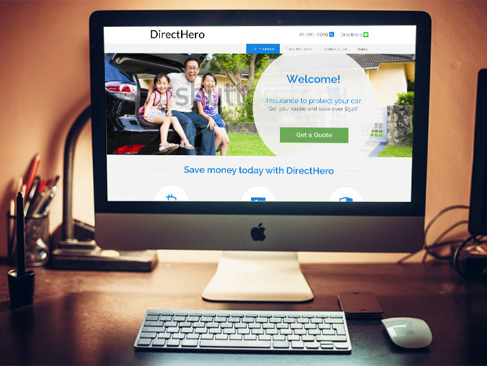
Direct Hero
2015
donna
2015