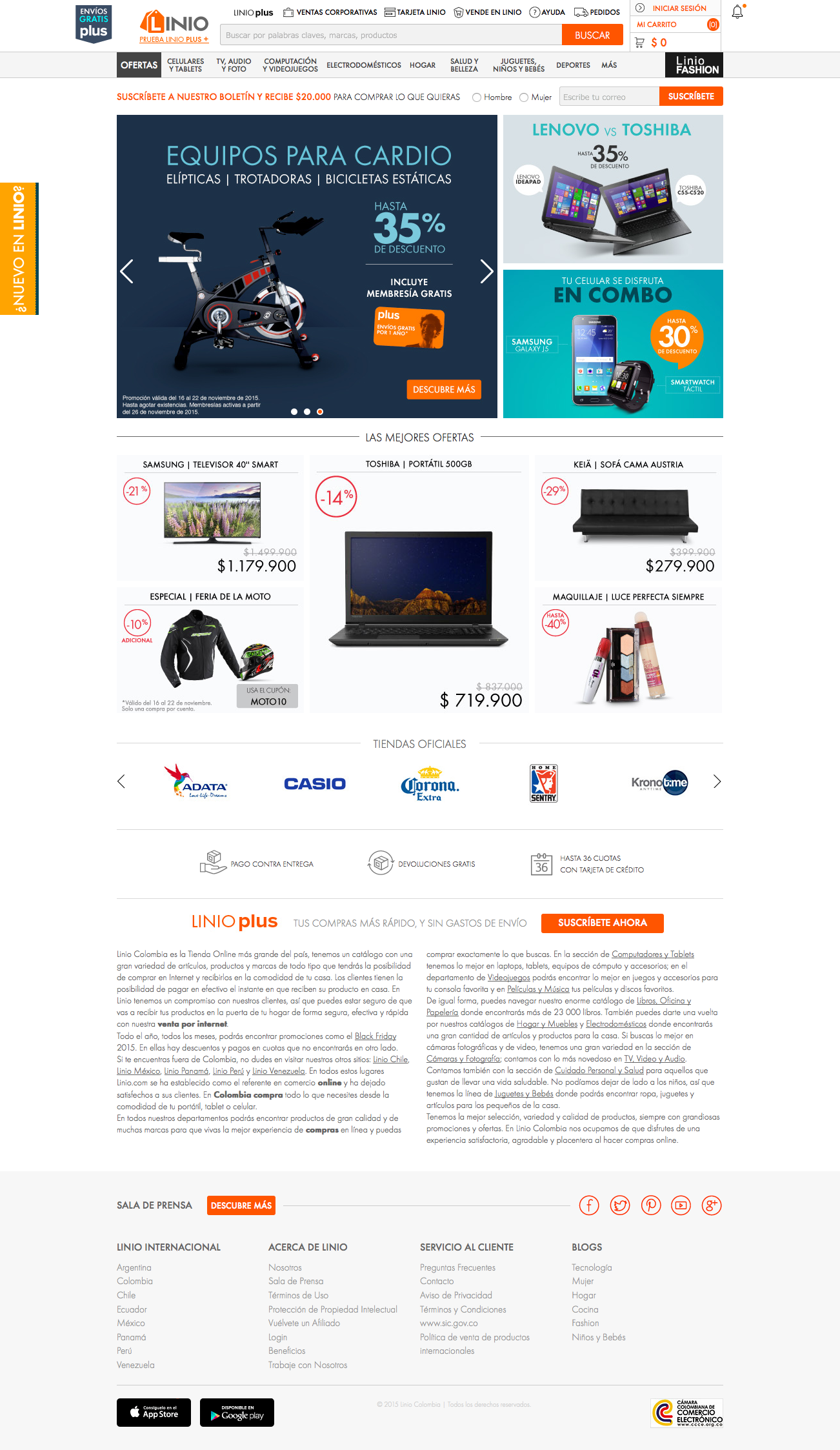
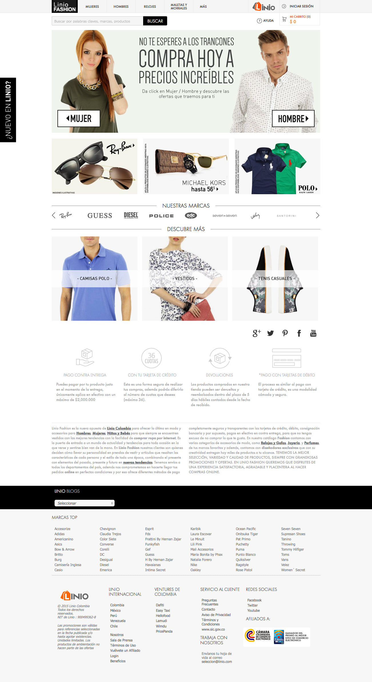
Linio, at its peak, was the top website of e-commerce in Mexico, surpassing even giants like Amazon and Walmart. Faced with the challenge of maintaining its leading position, we embarked on an ambitious redesign project to elevate the user experience to new heights.
We immersed ourselves in the latest design trends, adopting a minimalist approach to optimise the site's aesthetics and functionality. With an emphasis on efficiency, we aimed to drastically reduce home page loading times, ensuring that every visit was smooth and seamless.
To guide our transformation, we relied on a wide range of tools, from heat-maps to sales analysis and market surveys. These valuable insights allowed us to identify the redesign's needs and determine the most popular actions on the home page, laying the groundwork for an even richer experience.
We reimagined the main menu, incorporating the most demanded subcategories to facilitate user navigation. Additionally, we reserved generous space to highlight irresistible promotions through eye-catching banners. Furthermore, we simplified access to login and shopping cart with intuitive and easy-to-understand iconography.
