Nurturing the blossoming world of baby care in Mexico, Bebe2Go emerges as a beacon of convenience and quality in the online retail landscape. Specialising in a curated selection of baby products, this platform was a heaven for parents seeking the finest essentials for their little ones.
Embarking on a quest for innovation and excellence, was set out to revamp our digital presence, infusing it with a fresh aesthetic while enhancing performance and elevating the user experience. Drawing inspiration from industry stalwarts like Pottery Barn, Target, Carters, and Walmart, the redesign journey was fuelled by a meticulous study of their best practices.
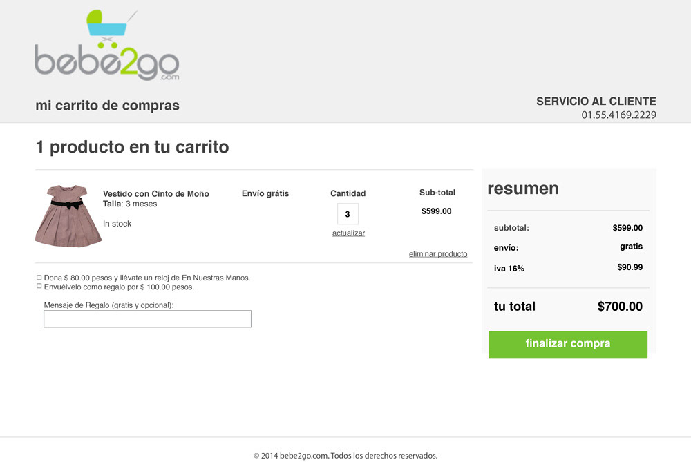
Through comprehensive benchmarking was necessary to dissect the nuances of each competitor's approach to design and functionality. Armed with this knowledge, was necessary to set about fine-tuning Bebe2Go's interface and user journey, enhancing key areas such as product discovery, menu navigation, and checkout efficiency.
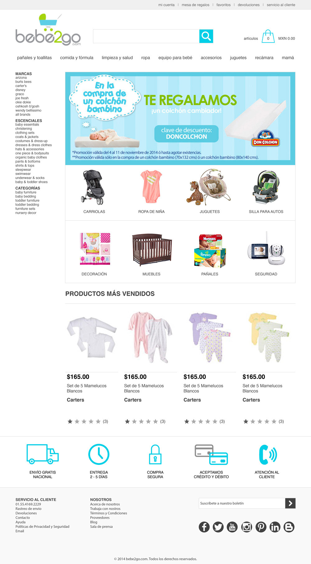
The result was an harmonious fusion of style and substance, where every element is thoughtfully crafted to delight and empower our users. From the seamless distribution of new arrivals on the homepage to the intuitive layout of product pages brimming with essential information and complementary offerings, every detail has been optimised for maximum impact.
But the commitment to excellence doesn't end there. Leveraging cutting-edge tools and technologies, we've equipped Bebe2Go with advanced features such as Google Analytics for insightful campaign tracking, heat mapping for deep user engagement analysis, and rigorous A/B testing for continuous refinement.
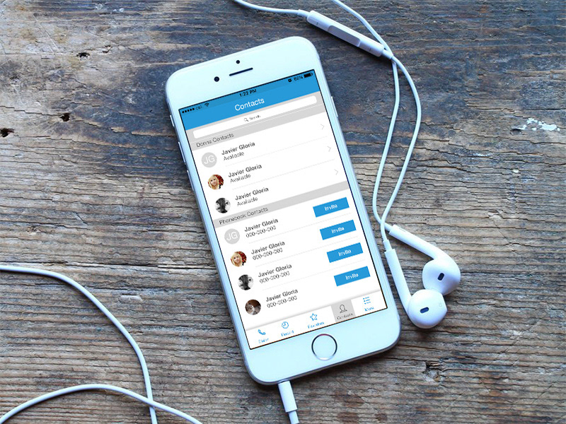
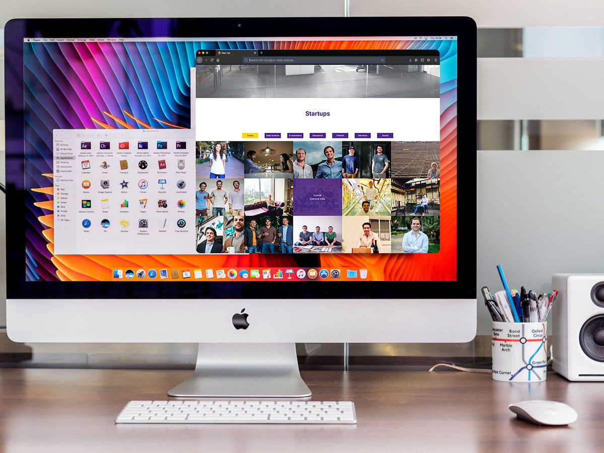
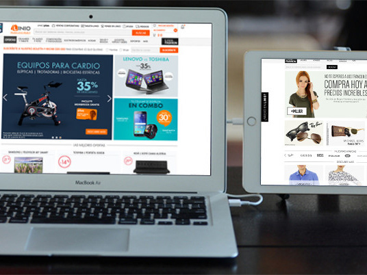
And of course, no modern digital experience would be complete without full responsiveness, ensuring a seamless journey across devices of all shapes and sizes.
